A brand has to have something to say before it has something to be recognized by. The logo only makes that sentence visible. Draw the mark too early and you are left with a handsome shape that attaches to nothing: not to the voice, not to the product, not to the decision someone will have to make next month.
At 2Dots the logo waits at the back of the line. Not out of manners. Until we know who the brand is speaking to, what it promises, and which work it will refuse, every symbol is a guess.
Why a logo that arrives first empties the brand
Most projects open with one sentence: “We need a logo.” Behind it there is usually a deadline. The card has to go to print, the profile needs a picture, the packaging is waiting on the production table. A logo feels like the fastest way to prove that a brand exists.
A logo does not prove. It reminds. If there is nothing to remember, the mark is decoration. Next week the site color changes because it fights the product photo. Next month the poster type changes because the headline will not fit. A year later everyone asks why this symbol is ours.
An early mark has three costs:
- It holds later decisions hostage to a shape that does not mean anything yet.
- It pushes the team to invent a story in defense of the logo, instead of letting the story produce the logo.
- Every new surface — site, pack, uniform, booth — becomes an exception.
What identity is, once the logo is set aside
Identity is the set of decisions that turns a loose name into predictable behavior. People do not need to list those decisions. They need to feel that wherever the brand appears, it is the same person.
For us that set contains at least this:
- A specific audience, not “everyone.”
- A promise that can be said in one sentence and shown in the product.
- A voice that stays one voice in writing, image, and silence.
- A name that does not tire the mouth and does not leave the memory.
- A system of color, type, and image that is recognizable with the logo covered.
- And last, a mark that can carry that system at the smallest size.
Remove the sixth item and keep the first five, and the brand is still a brand. Keep only the sixth and what you have is a vector file.
If the logo is covered and the page still looks like someone in particular, the identity is working. If it does not, the mark is carrying the whole weight alone, and it will tire.
The order of work in the house
We do not start a project from the symbol. We start from questions. The questions are short. The answers are not.
Who it is for, and who it is not for
If the answer is “for everyone,” there is no project yet. A boundary builds a character. A brand willing to lose one group has found its voice. A brand afraid to lose anyone speaks in a tone no one can remember.
The promise, not the slogan
Not an advertising line. A promise the product or the service has to keep every time. “Fast,” “precise,” “warm,” “plain-spoken” are only words until an example sits beside them. A pack that opens slowly and a pack that shouts are two different promises, even when both are beautiful.
Voice, written as sentences
We do not define voice with broad adjectives like “modern” and “minimal.” We define it with sentences. How does the brand say hello? How does it say the price? How does it apologize? Three true sentences are more honest than a forty-page book.
The name, before the shape
The name is where identity is heard for the first time. The logo is seen. The name is said, searched, and repeated on the phone. If the name will not sit in the mouth, the finest symbol will not save it.
2Dots came from that place: a short distance between an idea and the thing a person actually sees. The name does not explain the job. It holds a position. That difference matters. A name that shouts the trade becomes tight the day the work grows. A name that is only pretty, tied to no decision, is forgotten.
Once the name has settled, type can be discussed. Letter-spacing, proportion, and whether it stays readable in both Persian and English. Many logos are beautiful in one script and accidental in the other. A bilingual identity has two mouths from the first day.
Color and type that do not lean on the mark
Brand color is not logo color. Color is the air of the room in which the brand speaks. One red trapped inside a symbol leaves the poster white and the packaging to taste. A color system means a lead color, a companion, a color for quiet, and a rule for use. Voice has a rule. Surface needs one too.
Type is the same. One family for titles, one for text, and sizes that do not fall apart on a card, a window, and a phone. Take the brand’s type away and leave only the logo, and a lot of brands disappear. That is a useful test. Look at the page with the symbol removed. If it is still obvious whose page it is, the identity has done its work.
Image is part of the identity, not a garnish beside the logo. Light, distance, subject, and whether the photograph shouts or speaks softly. A precise brand cannot bear a crowded picture. A warm brand refuses a cold studio shot. These choices are made before the symbol is drawn, because changing them later is more expensive.
When it is finally the logo’s turn
Now the mark has something to mean. We know it must survive at sixteen pixels beside the name, stay legible on a foil stamp, and — if motion is ever required — not fall apart. The shape comes from constraints, not from the designer’s mood that afternoon.
A good logo does three things:
- It is still itself at the smallest size.
- It is tied to the color and type system, not pasted on top.
- If it is covered, the brand is still recognized by other means.
A weak logo is beautiful only in the presentation. On a white artboard, with a shadow, at a large size. Put the same file on a product photo, on cloth, or beside a long line of Persian text. If it loses its breath there, it is not a logo yet. It is a proposal.
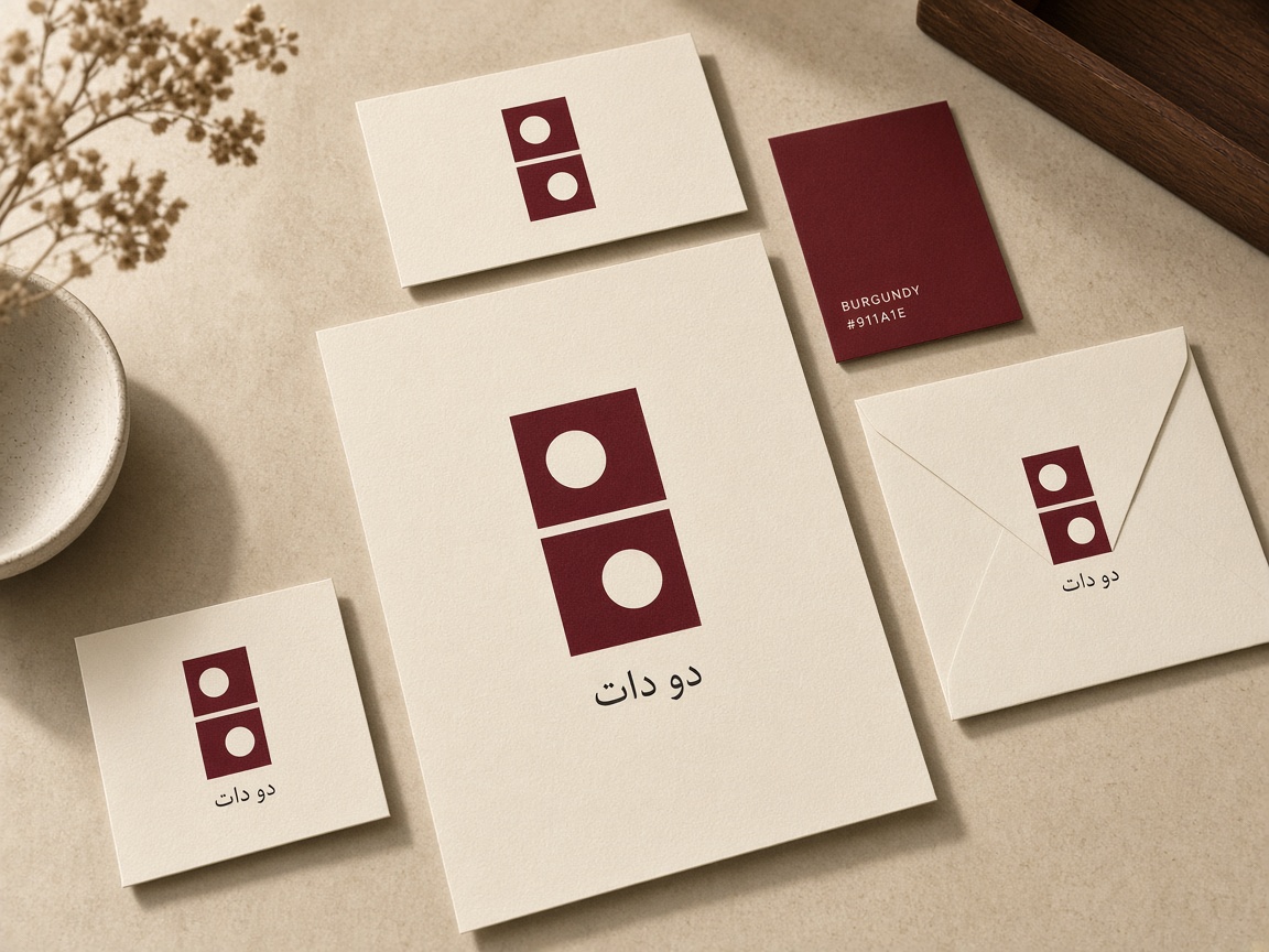
At 2Dots the symbol often comes from a very small idea. Two dots. One interval. One repetition. We spend complexity where meaning asks for it, not where the file needs to look heavy.
Ask this before you approve
Before saying “this one is right,” ask it of yourself and of the designer:
- Which promise does this shape carry? If the only answer is “it looks modern,” go back to the voice.
- Can it be recognized without its special color?
- Do Persian and English sit in balance beside each other?
- Is it clear on a busy ground, a dark ground, and a light ground?
- What does a stranger understand in two seconds, and what do they not need to understand?
- If the logo is removed, do the card, the site, and the pack still come from one house?
The sixth question is where a real project separates from a decorative one.
Identity does not end at approval
Once the logo is approved, the identity starts to live. Every post, every invoice, every reply to a customer either thickens it or puts a hole in it. A brand guide exists for that reason. Not as an album for a drawer, but as a rule the team can use when the designer is not in the room.
At 2Dots we build each project like a narrative. A narrative has a beginning, a middle, and a sign. The logo is the sign. If the beginning and the middle were never written, the sign is only a decorative dot at the end of a sentence that does not exist.
Identity comes first. The logo arrives when the brand already has something to say.